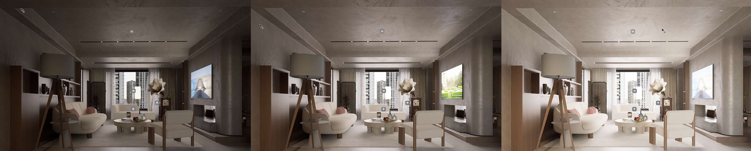
Color grading is an essential step in transforming your D5 Render visuals from ordinary to extraordinary. It shapes the mood, adds realism, and helps guide the viewer's attention. In this guide, we'll walk you through how mastering the Effect Panel in D5 can elevate your architectural renders. From basic exposure adjustments to advanced HDR tone mapping, we'll cover everything you need to know to unlock the full potential of color grading in D5 Render. Let's dive in and discover how these tools can make your visuals truly stand out.

Why Color Grading Matters in Archviz (and Where It Lives in D5)
Color grading is a game-changer in architectural visualization (archviz), shaping how your renders feel and look. It goes beyond just making images look good—it sets the tone, enhances realism, and brings the project to life. The right color grading can highlight the textures and materials of a space, adding depth and atmosphere. Whether you're designing a sleek office or a cozy home, color grading helps guide the viewer's emotions and attention.
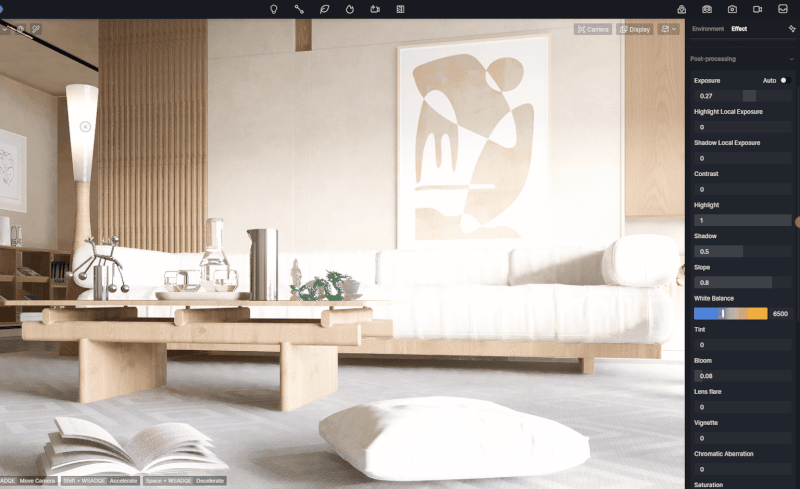
In D5 Render , color grading is made simple with the "Effect panel". This all-in-one tool allows you to adjust everything from exposure to adding stylish effects like bloom and vignette. Mastering these controls helps ensure your visuals stand out and speak volumes, creating a strong visual narrative that resonates with your audience.
1. Start with base exposure and contrast
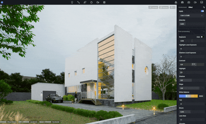
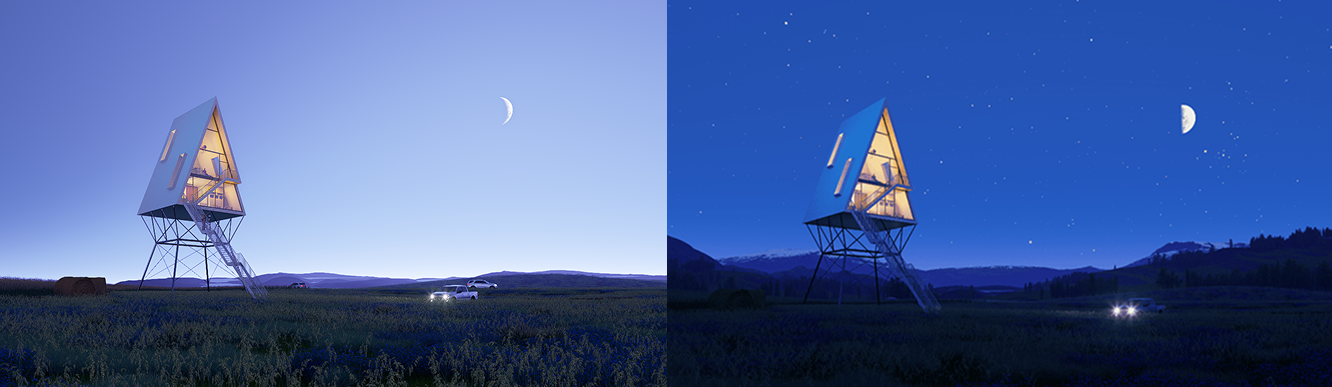
Before you chase a look, nail the base. Exposure sets overall brightness, just like a camera. In D5 Render , turn on the "Auto" switch, the renderer will automatically analyze the brightness of the screen and adjust to a proper value, similar to the effect of automatic adaptation of the human eye from a bright environment into a dark environment (or from a dark environment to a bright environment), or similar to the automatic exposure of a "Point and shoot camera", which can quickly find a suitable exposure base value for you.
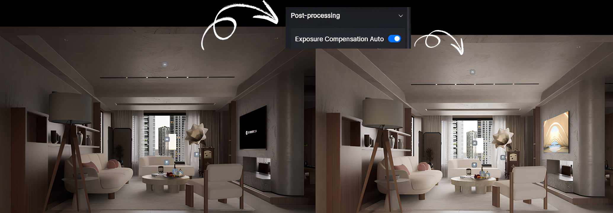
Prefer manual control? Turn Auto off and set the value yourself. Aim for detail in both brights and shadows—avoid clipped highlights and "dead black." If extremes creep in, try Highlight Local Exposure to tame hot areas and Shadow Local Exposure to open dark corners before moving on.
Tip: The higher the exposure value, the brighter the image, and the lower the exposure value, the darker the image.
Contrast defines how far apart light and dark tones sit. Lowering it pulls everything toward mid-gray for a softer, flatter image; raising it increases separation and perceived depth. Push too far, though, and you'll blow highlights and crush shadows. Adjust exposure and contrast together, in small steps, until faces, materials, and key surfaces read cleanly. This balanced base makes later color grading choices—HDR tone mapping, white balance, and LUTs—more consistent and predictable.
2. Understand D5's Tone Mapping Curve (the creative lever)
Tone mapping is D5 's way of converting HDR (high-dynamic-range) render data into an image that works on regular screens. Imagine a curve: the horizontal axis represents the scene's brightness, while the vertical axis shows what you'll actually see on your screen (as shown in the image below). The curve has two key zones— the shoulder on the right, where highlights gently fade to white, and the toe on the left, where shadows smoothly taper into black. This curve helps retain detail in both the bright and dark areas of the image, rather than letting them get lost or clipped.
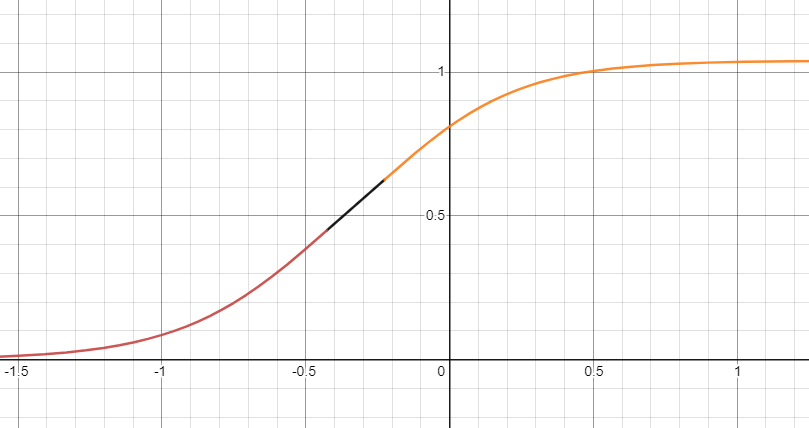
In D5 , three key controls shape the tone mapping curve: Highlight , Shadow , and Contrast . If your screen is overexposed, pulling the Highlight control to the left can recover those lost details, bringing the overexposed whites back into view.
Lowering the highlight value will soften the details in the bright areas, while increasing it enhances contrast, making highlights more vivid. It's all about finding the right balance, as pushing the control too far can either wash out or exaggerate those details.
When adjusting Shadow , reducing the value will reveal more detail in the darker parts of the image, though the contrast in the shadows will be reduced, giving them a more muted, grayish feel. On the other hand, increasing the shadow value deepens the blacks and increases contrast in the dark areas, adding more drama.
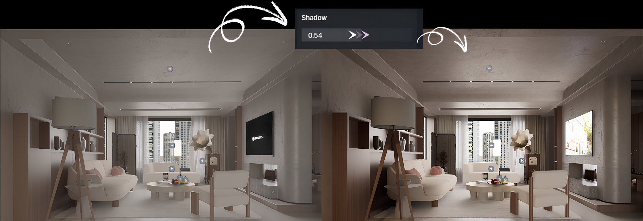
Finally, Contrast adjusts the overall difference between light and dark areas. Too little contrast can make the image look flat and washed out, while too much can push highlights into pure white and shadows into dead black. The key here is to work in small steps, refining exposure first, and always keeping an eye on both ends of the spectrum.
3. Neutralize color casts with White Balance and Tint
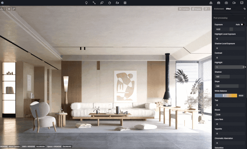
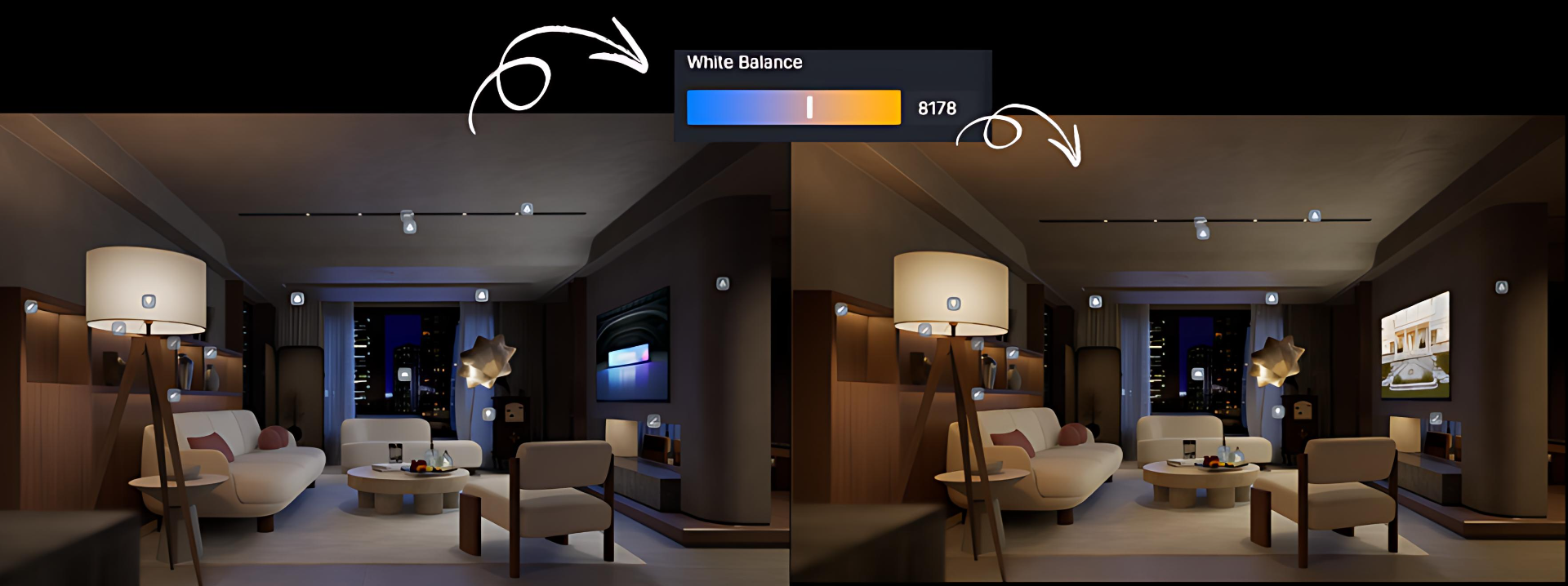
When color grading in D5 Render , white balance and tint are your go-to tools for getting natural, true-to-life colors. It fixes any color imbalances by adjusting the image to ensure that whites stay white and greys stay neutral, no matter the light source. This is especially important when lighting temperatures shift—whether it's warm or cool light, it can throw off your scene's colors. The default white balance setting in D5 Render is 6500 Kelvin (K), but you can tweak it to add warmth or coolness for a more artistic touch.
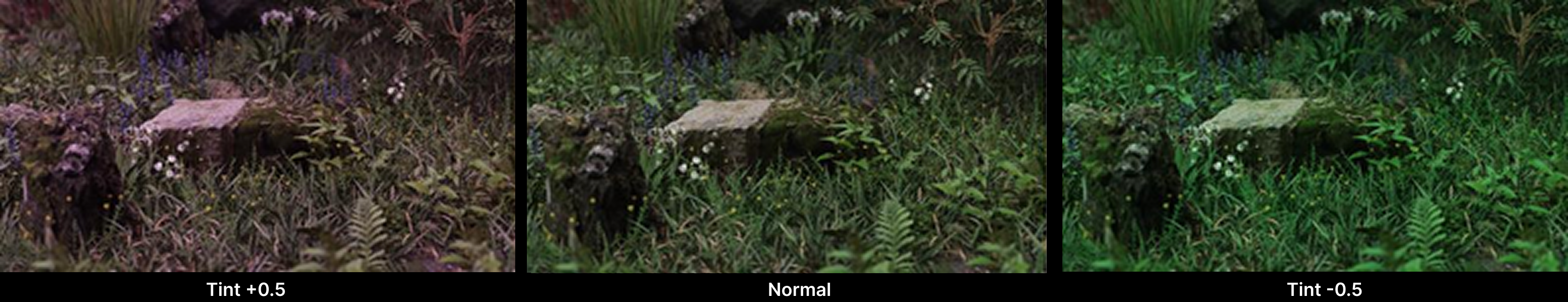
The tint tool fine-tunes the balance between cyan and magenta, helping to refine the color balance even further. By tweaking these settings, you can eliminate any unwanted color casts and get your scene's colors just right, whether you're aiming for a natural look or a specific visual style.
4. Add "Optics" Tastefully: Subtle Cinematic Polish in D5 Render
When it comes to adding "optics" effects in D5 Render , it's all about enhancing your visuals with subtle touches that elevate the realism without going overboard. Let's dive into some key effects you can use to add character to your renders.
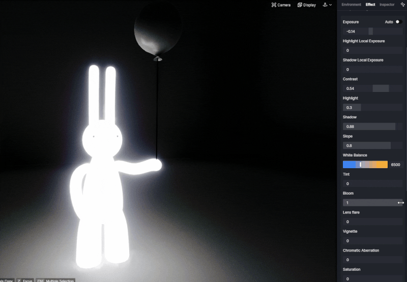
Bloom creates a soft, glowing effect around bright objects, especially when placed against darker backgrounds. The higher the bloom value, the more noticeable the glow becomes, giving your scene a dreamy, atmospheric vibe. Use it carefully to avoid overwhelming the shot.
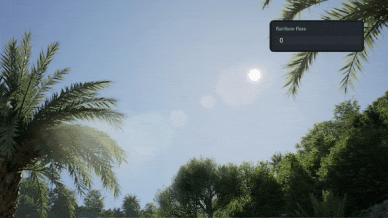
Rainbow Flare in D5 Render simulates the colorful glow around the sun seen through a real camera. It works with Geo and Sky (and is disabled in HDRI), and increasing the intensity makes the arcs and halo more pronounced—use a light touch to boost realism without washing out your scene.
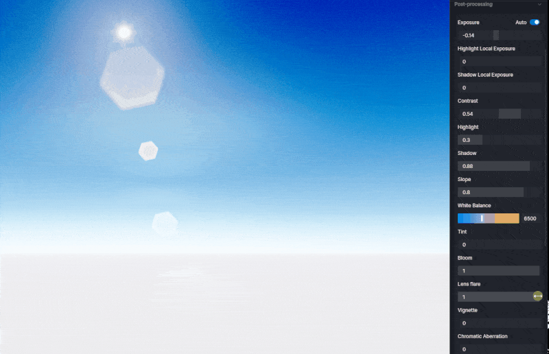
Lens flare simulates the halo effect created by a real camera lens when a bright light source is backlit. This effect produces a series of soft halos that radiate from the center of the frame. The higher you set the value, the more intense and noticeable the effect becomes. It's perfect for backlit scenes but can easily take over your image if cranked up too much, so a light touch is best.
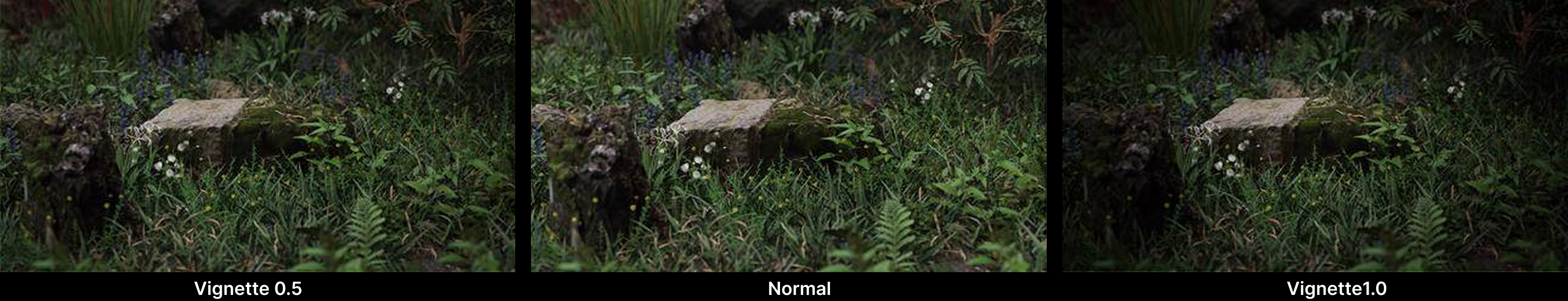
Vignette can simulates the real-world gradient falloff that gently reduces brightness toward the corners of the frame. It can subtly darken the edges, naturally guiding the viewer's eye toward the center of the scene. Used sparingly, it has a big impact—tightening composition and focus without distracting from the overall image. A simple, effective way to lead the eye without overdoing it!
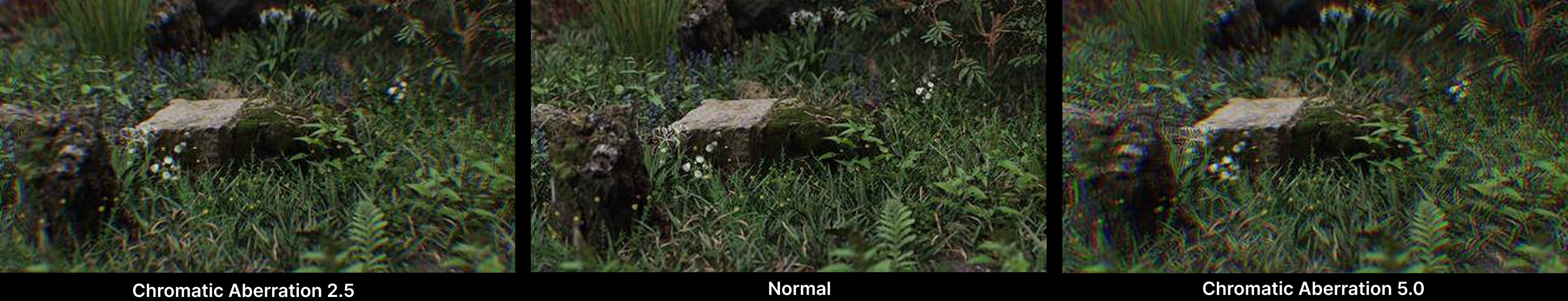
Chromatic aberration simulates the subtle color shift seen in real camera lenses. It introduces faint red/green or blue/yellow fringing along high-contrast edges, mimicking optical imperfections. Used with restraint, it adds authenticity and helps ground your scene in a more photographic reality.
Finally, saturation controls color intensity. Increase it to make hues pop; reduce it for a muted, natural feel. At high saturation, RGB components diverge toward pure colors. At low saturation, RGB values converge, reducing color information. Pull it to zero and the image becomes grayscale—only luminance remains.
5. Fast, consistent looks with LUTs (default & custom)
When you're in a rush but still want a polished look, LUTs (Look-Up Tables) are a lifesaver. D5 Render comes with five default LUTs that instantly give your scene a distinct style. You can switch between them using the drop-down menu, and adjust the Intensity slider to control how much impact the LUT has on your image. At intensity 1, the LUT is fully applied; drag it left to dial it down.
For more control, you can import your own LUTs in the .cube format by clicking +Customize LUT . These custom LUTs are stored in the "customlut" folder for easy access and management. Whether you're going for a warm cozy feel or a cool, cinematic vibe, LUTs are an efficient way to achieve consistent, professional results across multiple renders.
What is a LUT? A Guide to Color Grading in 3D Rendering
Discover industry-specific LUTs in D5 Render
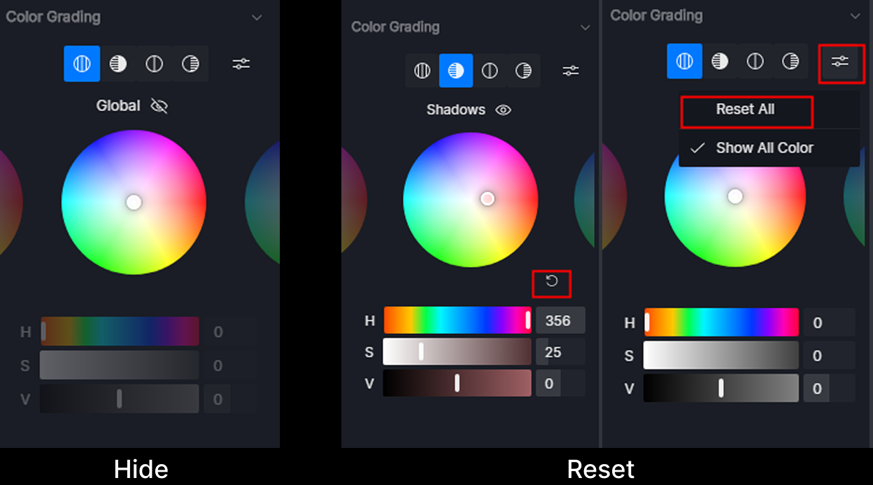
6. Precision grading with the Color Grading Widget
Want to tweak the mood of your 3D scene with precision? D5's Color Grading Widget is your secret weapon. Find it in Menu > Preference > Widget to activate it (if you haven't already).
Think of it like a professional photo editor - you get four color wheels (Global, Shadows, Midtones, Highlights) to independently tweak different parts of your render. Start by setting the overall vibe with the Global wheel, then dive deeper: fix muddy shadows, enhance rich midtones, or adjust glowing highlights.
The best part? You can hide effects temporarily for quick before/after checks, and reset anything that doesn't work. Drag the wheels or punch in exact HSV values - the choice is yours. It's like having a color correction Swiss Army knife right inside D5 !
Pro tip: Always start with Global adjustments , then work your way to more targeted tweaks for cleaner, more balanced results.
Conclusion: The Foolproof Color Grading Order in D5 Render
Follow this 5-step workflow for polished, professional results every time:
- Normalize – Start with global Exposure, adjust Contrast next, then use Tone Mapping (Highlights/Shadows/Slope) to even out lights and darks.
- Neutralize – Fix color shifts via White Balance and Tint—make sure grays and whites appear truly neutral before stylizing.
- Character – Turn on a LUT at low-to-moderate intensity for fast, uniform looks across views.
- Targeted Polish – Refine tones precisely with the Color Grading Widget, tweaking shadows, midtones, or highlights individually.
- Optics – Wrap up by adding subtle Bloom, Lens Flare, Vignette, Chromatic Aberration, or Saturation—just for polish, not to cover up bad exposure.
Ready to elevate your renders? Download D5 Render now and explore the powerful tools in the Effect Panel for seamless color grading. Start creating stunning, professional visuals today!
Continue Reading: More About D5 Render's Environment Adjustment Tools
4 Best Tips of Realistic Environmental Lighting for Architecture >
Best practices of interior lighting for SketchUp >
How to Use Emissive Material in D5 for Better Lighting of Your Renders >
How to Use D5 Studio's Curated Environment Presets >
What Is an AI Agent? How D5 2.11 Automates Landscape Design? >